Exploring spaces and challenging perceptions
For this project I was asked to take 2 photographs within a 5 minute walk from the classroom that differ in that:
Image 1: This picture should be one which would normally be unattractive to the human eye, but has been taken to make it look appealing, for example using multiple colours.
- As you can probably tell this is a picture of a bin, however because of the bright variety of colours, it is quite a nice photograph.
- Adding on to this, I think that it would be a good idea to to capture photographs from a variety of different bins comparing the contents of each one.

Image 2: This photograph would normally be engaging visually, however once taken on camera, it becomes all gloomy.
- This photo is meant to be of a beautiful, colourful bouquet of flowers. However the desaturated colours creates a weak, dying affect and the idea that there is a lack of life and unable to bloom to its potential. To improve this image, I think that I should take this image out of focus, causing it to become an even worse photo.

Images Analysis – Formal Elements

I decided to do an analysis on an American artist called Minor White. he specialises in monochrome photographs of landscapes, people, and abstract subject matter, using the human eye to create a strong sense of light and shadow. throughout his life he taught many photography classes, workshops and retreats, one being the California school of fine. For most of his life, he lived as an isolated gay man not having the courage to express his sexuality to the public. When editing all of these photographs, I changed them into black and white which makes the centrepiece stand out as there is not as much obstructing the focused part.
Viewpoints:
Adding on the project of photographer’s eye, for the topic of viewpoints I was asked to create a series of images in school that play with the idea of viewpoints. To capture these photos and to create it using the perfect angle, we had to turn the positioning of the camera or object being photographed.
- I took image one in my village in France of multiple, colourful umbrellas. looking upwards with my camera. I like the way that when the photo is changed into monochrome, there are different shades varying from darker greys to lighter greys and white. However, I think that it’s annoying looking up at the umbrellas and believe that it wasn’t the greatest way to capture viewpoints. To improve this, I would like to have taken a picture from a Birdseye view from the top of a building for instant.
- Image two was taken at the side angle of a stop sign in the school grounds, I like the way that the curved line and circular shape presents an interesting background of negative space.
- Image three was taken of the Farringtons flagpole, placing the camera at the bottom with the lenses looking upwards. I like the way that the camera is angled and that it shows a larger amount of pole at the bottom and a smaller amount at the top. The clear lines create a direction causing the eye to be drawn upwards. On the other hand, I feel the rope on the left hand side is a bit distracting and especially when it’s full colour.
- photograph four was taken of another sign, although I used a rotating technique on Lightroom to rotate the image and make the image more unique. I like the way that the camera focuses on the sign in the centre and then the clouds are out of focus making the sign stand out, especially as they are the same sort of colours.
- photograph five was off part of a climbing frame. I rotated the image to make it upside down, as I liked the way that instead of the use of lines bringing bring the object upwards, the straight intricate lines draw your eyes towards the bottom of the image. To refine this image, I would like to take a photo with a different colour floor as they are quite similar in monochrome and in colour.
- Picture six was taken from the bottom of a stair rail, the angle created forms a straight line leading into the background of the image. In future when taking the same picture, I would prefer to have more of the stair rail in focus
- I took image seven of a railing higher up therefore creating a picture from a different viewpoint, which may have not been noticed on an average day. I like the way that the repetition of the railings becomes smaller as you go further to the right of the picture making a curved line which draws the eye in that direction. although in my opinion, I would prefer to put the railing in more focus.


1 
2 
3 
4 
5 
6 
7
Visual Analysis – Alexander Rodchenko

I decided for my viewpoints topic, to look at a photographer called Alexander Rodchenko who is well-known for being one of the most significant avant-garde artist to have published his photographs “in the service of political revolution” and also being one of the most “inspirational founders of the constructivist movement. In 1910-1914 Rodchenko studied at the Kazan school of art of which he studied under the work of artist: Nikolai Feshin and Georgii Medvedev
TAKEAWAY POINT
I like the way that Rodchenko has made the ladder as the centre of attention as it draws your eyes up through the middle of the photograph. However I feel that the building to the right is a bit disrupting, I think it would’ve just been better with the main building at the top of the image.
Refined ViewPoint Photographs:


Straight Photography Investigation
My understanding of modernist photography and straight photography is the repetitive use of lines whether they’re straight or curved, Lots of modernist photographers incorporate multiple line throughout their work which draws your eyes to a particular part or an image. The use of clearly defined shapes is another example of how modernist photography can be identified.
Paul Strand and Straight photography:
One photographer in particular who specialises in modern and straight photography is Paul Stroud. Who’s passion is to photograph the lives of small communities around the world.
Compare and contrast:


The left pictorial looking image was created by the artist; Edward Steichen and is known as “The pond moonlight”. The second image was created by Photographer Ansel Adams who captured this unique, organic photograph.
As you can see, there are many similarities between these two images. Pictorial images tend to contain more of a textured feel to it, as in earlier days, the camera quality tended to not be as good quality, whilst containing diluted colours to add warmth to the photograph. Adams has a newer, better-quality camera than Steichen, so can focus and create clearer details throughout his work. Although there can be changes in the quality of the cameras, increasing its design and uses, photos can still have its similarities, for example they both use detailed lines drawing your eyes and attention to a certain part of the picture. Also, they both incorporate a repetition of the trees and branches, which provide texture
Drawing inspired by Paul Strand:
For this exercise I was asked to create a drawing inspire by the work of Paul Strand.
His picture is mainly about his use of bold, curved lines and different shadows. For example I used a darker shade of pencil where his shadows where darker and a lighter shade of the pencil on the object. Also in his image when there are bolder lines, I created a dark line to make it stand out. He incorporates repetition of the objects which, so I tried to create similar lines and shapes throughout the drawing Really this picture just consists of lines and circular shapes. However his use of shadow and form makes this photograph really interesting and eye drawing.

The World is flat
For this project I was asked to capture a series of photographs that were taken without the use of leading lines.
For example: As you can see, between the two images, there is a slight difference between the way that they were taken. As you can see, the photograph on the left would’ve been taken at an angle lower to the ground looking up, creating leading lines whereas the image on the right was taken at eye view and is without and angles, it just contains multiple different shapes.


These six photos represent the topic “The world is flat” as they do not contain any angles just contains several lines and shapes. For example, squares, rectangles, lines, triangles, etc.


Walker Evans:

Walker Evans was an American photojournalist and Photographer born on 3rd November 1903 and passed away on 10th April 1975. He specialised and was best known for his good work on the Farm Security Administration (FSA) especially the effects that the great depression had in American society.
His work:
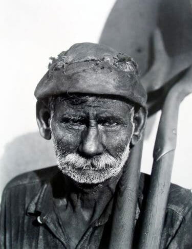
This is an example of ones of his pieces of art. As you can see his type of art evoques emotion and sadness towards the audience
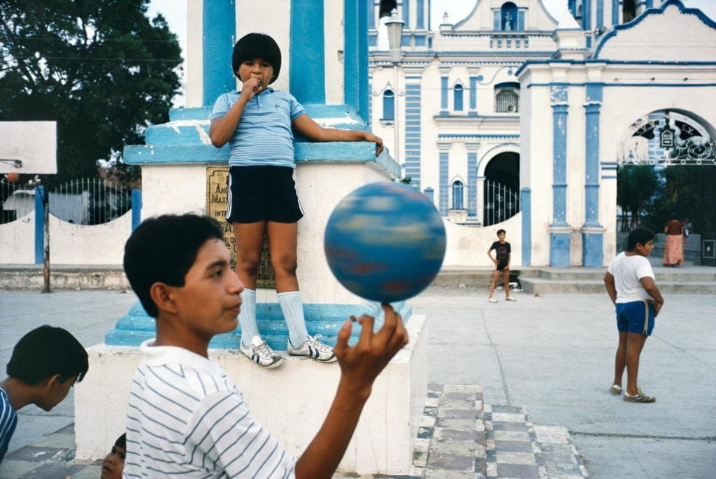
Alex Webb

Alex Webb is an American Photographer who creates complex and colourful images. His photos always contain a foreground, middleground and background whilst still creating a flat image.
His work:

This is an interesting photograph capture by Alex Webb, as it consists of lots of colours and shapes, at the same time as having lots of interesting angles which capture the eye.
The comparison between the two:
Both Photographers have similar approaches towards the way they capture their photographs, however there are noticeable differences throughout their images, and obvious example would be the use of tone and colour. Walker Evans often used a monochrome style whilst Alex Webb decided to create his using several bright and vibrant colours.


0 comments on “Photographers Eye” Add yours →